Designing Onboarding That Speaks the User’s Language
ContactCars.com is the first and leading specialized platform for Auto enthusiasts who are interested in anything related to automotive, especially in purchasing and selling new/used cars


Scope
Product Design
Cross-functional member
Research and UX design
Illustration and visual design
Collaborators


The Ask
Student Ask
Students needed clarity on why they were joining Noon and what value the app offered them. To address this, I designed onboarding screens that clearly communicated the benefits and set expectations from the first interaction.
Teacher Ask
Noon was introducing a new editing feature for teachers to modify their session content. I designed an animated onboarding experience to showcase the feature in context, making it easier for teachers to understand and adopt with minimal friction.
The Task
As interaction designer
Created a custom illustration for the onboarding experience
Led UX writing sessions to generate student-centered copy
Facilitated cross-functional brainstorming workshops
Developed animations using Lottie and After Effects
Capture Real User Intent
To design an onboarding experience that truly resonates, I first needed to understand what students were thinking when they joined Noon.
What were they expecting?
What benefits were they actually looking for?
And which of those were unmet?
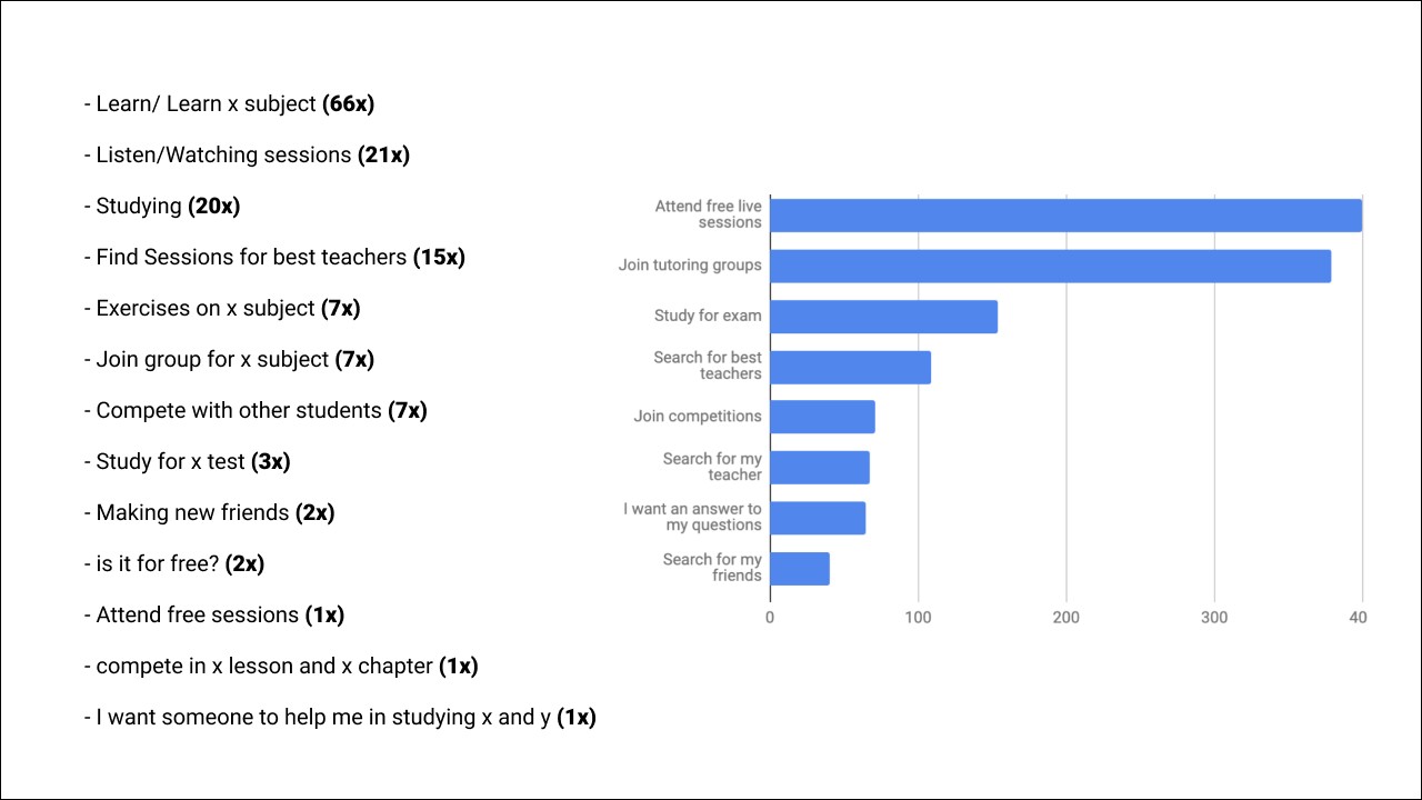
By collecting data directly from student inputs, I uncovered key motivation patterns.
The most frequent responses centered around learning specific subjects, joining live sessions, and finding great teachers. These raw insights shaped both the tone and structure of the onboarding journey.
UX Writing Tactic
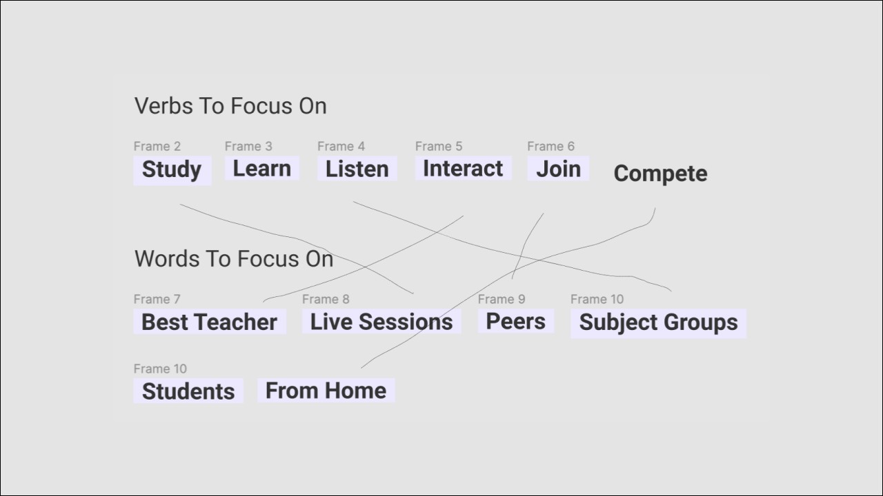
I used students’ own words to craft copy that feels natural and relatable.
By capturing the verbs they used and the themes they cared about, I combined them into short, benefit-driven statements that reflect how they think and talk about learning.
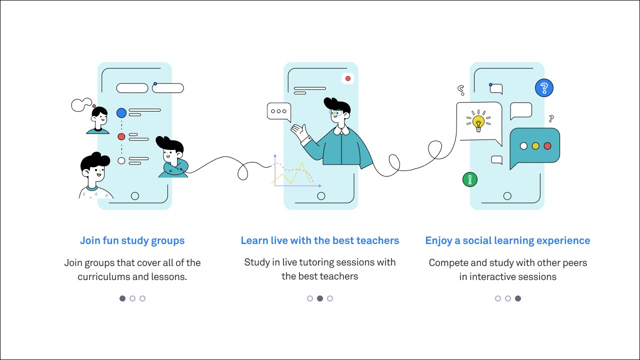
Student Onboarding Redesigned with Real Language
I rewrote the onboarding experience by grounding every message in words students actually used.
The result is a more human, relatable flow that speaks directly to their goals joining groups, learning live, and studying with peers. Instead of explaining the app, the onboarding now mirrors the student mindset, making the experience feel familiar from the start.

Teacher Feature Onboarding Redesigned too!
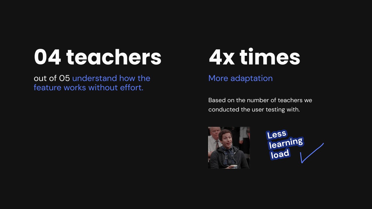
When Noon decided to introduce a new feature that allowed teachers to edit their session content, the challenge wasn't just technical—it was behavioral. Teachers were already familiar with a fixed flow, and any change risked confusion or resistance.
Rather than relying on documentation or tooltips, I proposed an animated onboarding walkthrough.
My goal was to show the feature in action, not just explain it.
By placing the animation directly within the flow teachers already used, we reduced learning time and made the experience feel intuitive.
The result was a smooth rollout with minimal friction. Teachers quickly grasped the value of the new capability and were able to adopt it without additional support or training.
1- Ask the right questions.
2- UX writing matters!
3- Be conventional!